Time Series Components
Each data point () at time in a Time Series can be expressed as either a sum or a product of 3 components, namely, Seasonality (), Trend () and Error () (a.k.a White Noise).
For Additive Time Series,
For Multiplicative Time Series,
A multiplicative time series can be converted to additive by taking a log of the time series.
Seasonality [14]
In time series data, seasonality is the presence of variations that occur at specific regular intervals less than a year, such as weekly, monthly, or quarterly. Seasonality may be caused by various factors, such as weather, vacation, and holidays and consists of periodic, repetitive, and generally regular and predictable patterns in the levels of a time series.
Seasonal fluctuations in a time series can be contrasted with cyclical patterns. The latter occur when the data exhibits rises and falls that are not of a fixed period. These fluctuations are usually due to economic conditions and are often related to the "business cycle." The period of time usually extends beyond a single year and the fluctuations are usually of at least two years.
Detecting Seasonality [14]
The following graphical techniques can be used to detect seasonality:
- A run sequence plot will often show seasonality
- A seasonality plot of US electricity usage

- A seasonal plot will show the data from each season overlapped

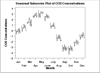
- A seasonal subseries plot is a specialized technique for showing seasonality
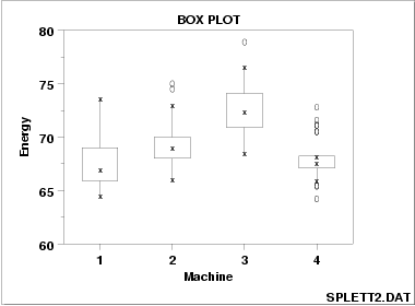
- Multiple box plots can be used as an alternative to the seasonal subseries plot to detect seasonality
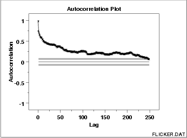
- An autocorrelation plot (ACF) and a spectral plot can help identify seasonality.
- Seasonal Index measures how much the average for a particular period tends to be above (or below) the expected value
A really good way to find periodicity, including seasonality, in any regular series of data is to remove any overall trend first and then to inspect time periodicity.
The run sequence plot is a recommended first step for analyzing any time series. Although seasonality can sometimes be indicated by this plot, seasonality is shown more clearly by the seasonal subseries plot or the box plot. The seasonal subseries plot does an excellent job of showing both the seasonal differences (between group patterns) and also the within-group patterns. The box plot shows the seasonal difference (between group patterns) quite well, but it does not show within group patterns. However, for large data sets, the box plot is usually easier to read than the seasonal subseries plot.
The seasonal plot, seasonal subseries plot, and the box plot all assume that the seasonal periods are known. In most cases, the analyst will in fact, know this. For example, for monthly data, the period is 12 since there are 12 months in a year. However, if the period is not known, the autocorrelation plot can help. If there is significant seasonality, the autocorrelation plot should show spikes at lags equal to the period. For example, for monthly data, if there is a seasonality effect, we would expect to see significant peaks at lag 12, 24, 36, and so on (although the intensity may decrease the further out we go).
An autocorrelation plot (ACF) can be used to identify seasonality, as it calculates the difference (residual amount) between a value and a lagged value of . The result gives some points where the two values are close together ( no seasonality ), but other points where there is a large discrepancy. These points indicate a level of seasonality in the data.
An ACF (autocorrelation) plot, of Australia beer consumption data. Semiregular cyclic variations might be dealt with by spectral density estimation.
Seasonal Plots
A seasonal plot is similar to a time plot except that the data are plotted against the individual "seasons" in which the data were observed.
Seasonal Subseries Plot [22]
Seasonal subseries plots are a graphical tool to visualize and detect seasonality in a time series. Seasonal subseries plots involves the extraction of the seasons from a time series into a subseries. Based on a selected periodicity, it is an alternative plot that emphasizes the seasonal patterns are where the data for each season are collected together in separate mini time plots.
Seasonal subseries plots enables the underlying seasonal pattern to be seen clearly, and also shows the changes in seasonality over time. Especially, it allows to detect changes between different seasons, changes within a particular season over time.
However, this plot is only useful if the period of the seasonality is already known. In many cases, this will in fact be known. For example, monthly data typically has a period of 12. If the period is not known, an autocorrelation plot or spectral plot can be used to determine it. If there is a large number of observations, then a box plot may be preferable.
Box Plot
In descriptive statistics, a box plot or boxplot is a convenient way of graphically depicting groups of numerical data through their quartiles. Box plots may also have lines extending vertically from the boxes (whiskers) indicating variability outside the upper and lower quartiles, hence the terms box-and-whisker plot and box-and-whisker diagram. Outliers may be plotted as individual points.
Box plots are non-parametric: they display variation in samples of a statistical population without making any assumptions of the underlying statistical distribution. The spacings between the different parts of the box indicate the degree of dispersion (spread) and skewness in the data, and show outliers. In addition to the points themselves, they allow one to visually estimate various L-estimators, notably the interquartile range, midhinge, range, mid-range, and trimean. Box plots can be drawn either horizontally or vertically. Box plots received their name from the box in the middle.
The box plot is a quick way of examining one or more sets of data graphically. Box plots may seem more primitive than a histogram or kernel density estimate but they do have some advantages. They take up less space and are therefore particularly useful for comparing distributions between several groups or sets of data (see Figure 1 for an example). Choice of number and width of bins techniques can heavily influence the appearance of a histogram, and choice of bandwidth can heavily influence the appearance of a kernel density estimate.
As looking at a statistical distribution is more commonplace than looking at a box plot, comparing the box plot against the probability density function (theoretical histogram) for a normal distribution may be a useful tool for understanding the box plot.

Autocorrelation Plot (ACF)
Measuring Seasonality
Seasonal Adjustment
There are many types of seasonality; for example:
- Time of Day
- Daily
- Weekly
- Monthly
- Yearly
As such, identifying whether there is a seasonality component in your time series problem is subjective.
The simplest approach to determining if there is an aspect of seasonality is to plot and review your data, perhaps at different scales and with the addition of trend lines.
The model of seasonality can be removed from the time series. This process is called Seasonal Adjustment, or Deseasonalizing.
A time series where the seasonal component has been removed is called seasonal stationary. A time series with a clear seasonal component is referred to as non-stationary.
Seasonal Adjustment Methods
- Differencing
- X11
- X12
- X12 - ARIMA
Short Time Series
- Calculate the average for the series, this will be the trend component.
- Calculate the difference between the original series and the trend.
- Calculate the seasonal factors (SF), which are the average of the residuals for a given time-period (day, hour, month, quarter, year, etc).
- Subtract the seasonal factor from the original series to get the seasonally adjusted series.
Differencing
Differencing helps to stabilize the mean. The differenced series is the change between each observation in the original series: .
The differenced series will have only values since it is not possible to calculate a difference for the first observation.
Seasonal Differencing
A seasonal difference is the difference between an observation and the corresponding observation from the previous time period (same time period, i.e. minute, month, year, etc).
where = number of seasons
Example
Using the following table
| Quarter | ||||
|---|---|---|---|---|
| 1992 Mar | 9.9 | 9.7 | 1.32 | 8.58 |
| Jun | 9.5 | 8.6 | 0.22 | 9.28 |
| Sep | 8.3 | 7.4 | -0.98 | 9.28 |
| Dec | 8.7 | 7.83 | -0.55 | 9.25 |
| 1993 Mar | 9.9 | 9.7 | 1.32 | 8.58 |
| Jun | 8.8 | 8.6 | 0.22 | 7.58 |
| Sep | 7.0 | 7.4 | -0.98 | 7.98 |
| Dec | 7.9 | 7.83 | -0.55 | 8.45 |
| 1994 Mar | 9.3 | 9.7 | 1.32 | 7.98 |
| Jun | 7.5 | 8.6 | 0.22 | 7.28 |
| Sep | 6.9 | 7.4 | -0.98 | 7.88 |
| Dec | 6.9 | 7.83 | -0.55 | 7.45 |
| Mean | 8.38 |
Source: Statistics New Zealand.
To remove a quarterly cycle, for example, we begin by averaging all the first quarters, namely , then averaging all the second quarters, all the third quarters and finally all the fourth quarters, giving us just four numbers , , and . We then subtract the mean of these four numbers (which is the same as of the original series) to get . The deseasonalized series is then given by , where the definition of is extended beyond the first year by simply repeating the same four numbers.
How do we know when to use log instead of ? If we are interested in proportional or percentage changes then taking logarithms may be more sensible. If the “height” variation of the irregular component or cycle tends to increase as the trend increases then these components would appear to be having a mutiplicative effect so that we would try logarithms. If we are not certain then we can try both and log and see which works best. We must experiment!
First Quarter Calculations
= 9.9 (Mar 1992) = 9.9 (Mar 1993) = 9.3 (Mar 1994)
Second Quarter Calculations
= 9.5 (Jun 1992) = 8.8 (Jun 1993) = 7.5 (Jun 1994)
Third Quarter Calculations
= 8.3 (Sep 1992) = 7.0 (Sep 1993) = 6.9 (Sep 1994)
Fourth Quarter Calculations
= 8.7 (Dec 1992) = 7.9 (Dec 1993) = 6.9 (Dec 1994)
Mean of each Quarter
Deseasonalize Series
Tests to Determine if Differencing is Required - Unit Root Tests
Augmented Dickey-Fuller Test
,
denotes the first-differenced series and is the number of lags to include in the regression (often set to be about 3)
If the original series, , needs differencing, then the coefficient should be approximately zero.
If is already stationary, then .
Additive Decomposition
= seasonal indices
Step 1 If is an even number, compute the trend-cycle component using a to obtain . If is an odd number, compute the trend-cycle component using an to obtain .
Step 2 Calculate the detrended series: .
Step 3 To estimate the seasonal component for each month, simply average the detrended values for that month. For example, the seasonal index for March is the average of all the detrended March values in the data. These seasonal indexes are then adjusted to ensure that they add to zero. The seasonal component is obtained by stringing together all the seasonal indices for each year of data. This gives .
Step 4 The remainder component is calculated by subtracting the estimated seasonal and trend-cycle components: .
Trend
Error
Time-Series Models
Usually, Time-Series Models are separated into two categories:
- univariate (, it is scalar)
- primary model: Autoregressions (ARs).
- multivariate (, it vector-valued).
- primary model: Vector Autoregressions (VARs).